The best virtual hair color try on is not necessarily the one with the most dramatic shades or the smoothest selfie. It is the one that lets you compare believable options while making its limits obvious. A useful tool helps you decide what to discuss at a salon: depth, warmth, placement, and maintenance. It should not make a permanent colour change look like a tap on a screen.
Look for features that respect the shape and texture of your hair
Photo masking is the feature doing the quiet, important work. A convincing tool separates hair from forehead, ears, neck, and background, then keeps fine pieces around the hairline from becoming a solid helmet. Check a close-up of the temples and the parting. If colour leaks onto the skin or leaves a bright outline, treat the image as a rough mood rather than a shade decision.
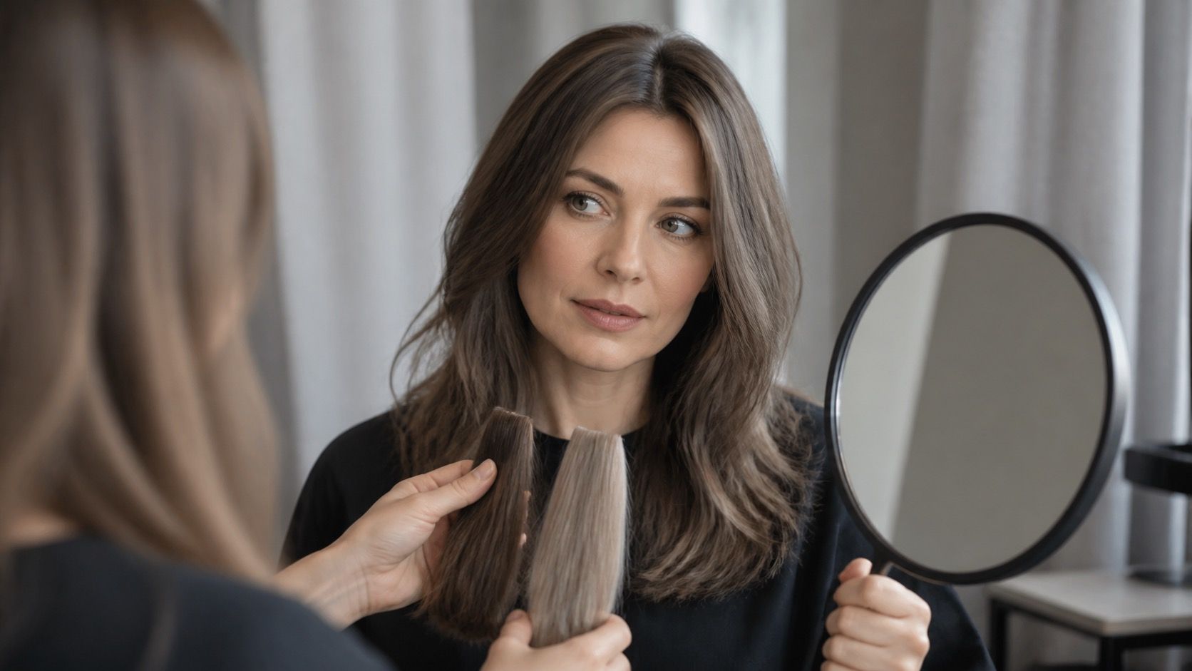
A better tool also preserves some variation. Natural hair reflects light differently at the root, mids, and ends, even before highlights enter the picture. When every strand becomes one opaque block, it is hard to judge how the colour will sit beside your skin. A little visible texture is more valuable than a glossy, perfectly even overlay.
Lighting controls or a clear warning about lighting are another good sign. A virtual result created from a yellow indoor photo can make a neutral brown look ashier than it really is. Use a daylight image first, then check a second photo in softer indoor light. If the colour direction stays sensible in both, it has earned more attention.
Photo upload and live camera answer different questions
Photo upload usually gives you the most controlled comparison. You can take a front-facing daylight photo with no beauty filter, use the same image for every shade, and revisit it later. That makes before and after comparisons less vulnerable to changing angles, facial expression, or the app deciding to brighten the whole frame.
Live camera mode is useful for movement and a quick sense of contrast. Turn your head slightly and notice whether a dark shade makes the brows look stronger or whether a lighter shade softens your face too much. But live mode is often more aggressive with smoothing and white balance, especially in low light. It is good for eliminating obvious noes, not for selecting a final formula.
For either mode, do not assume a flat overlay represents a salon service. A real colour may involve root coverage, a face frame, foil highlights, a gloss, or a root shadow. If the tool can simulate highlights or a darker root separately, that is far more useful than another row of neon colours. Placement often determines whether a reference looks natural.
| Feature | Why it matters | Quick test |
|---|---|---|
| Accurate masking | Keeps the colour on hair rather than skin and background | Zoom in around the parting, ears, and wispy hairline |
| Shade library by depth | Lets you compare realistic colours before fantasy options | Find neutral, warm, and cool versions at one depth |
| Highlight or root simulation | Shows placement rather than only flat all-over colour | Switch it on and check whether contrast remains believable |
| Exported reference | Makes a useful consultation record | Save the original photo beside two finalists and a near-miss |
Judge the shade library by range, not by the number of swatches
A large shade library can look impressive while offering twenty versions of the same saturated brown. The more helpful library lets you move through levels: dark blonde, medium blonde, light brown, medium brown, and so on. At each depth, look for a neutral, a warmer option, and a cooler option. That structure makes colour temperature easier to compare without getting lost in marketing names.
Pay attention to muted options. Many people arrive at a try-on because bright copper, icy platinum, or black feels exciting on screen, then realise in daylight that they prefer a softer version. Beige, mushroom, neutral brunette, soft auburn, and dimensional blonde labels are often closer to work a colourist can personalise. A library that includes them is more practical than one built around extremes.
It helps if the tool shows root coverage and highlight simulation as separate effects. Grey blending near the parting, for instance, is not the same as making the full lengths darker. A digital all-over brown might be a poor match for the service you actually need: subtle root coverage and a gloss through faded ends.
Do a small privacy check before adding your face to an app
Hair try-on images are still face images, so give the privacy screen a minute of attention. Look for a plain explanation of whether photos are stored, used to improve a model, shared with partners, or deleted after processing. If the answer is vague, use a cropped photo that includes hair, jawline, and neck but not your whole room or personal background.
A live camera mode may use a stream rather than saving an image, but do not assume that without reading the settings. Disable unnecessary contact access, location access, and social sharing. You do not need to post a before and after to test a colour. Saving an exported reference locally is enough for a thoughtful salon consultation.
Privacy is not a reason to avoid every tool; it is a reason to be deliberate. The same practical habit applies to screenshots: remove notifications and personal details before sending them to a salon. A clean reference image keeps the conversation focused on tone and placement.
Use a short checklist before booking the colour appointment
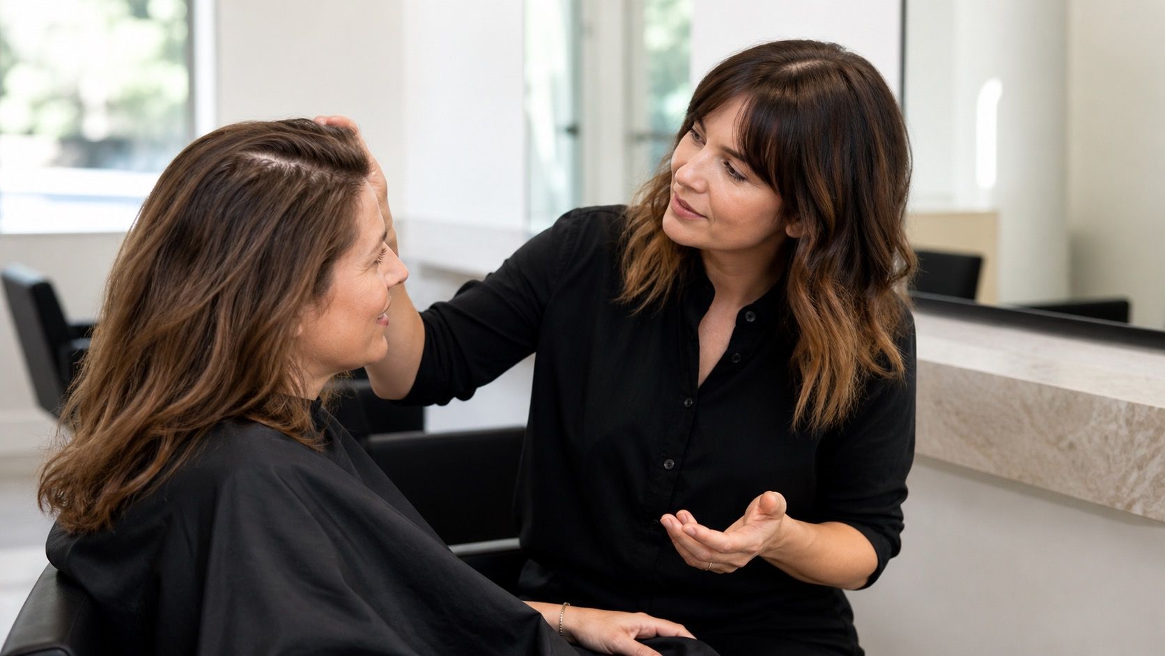
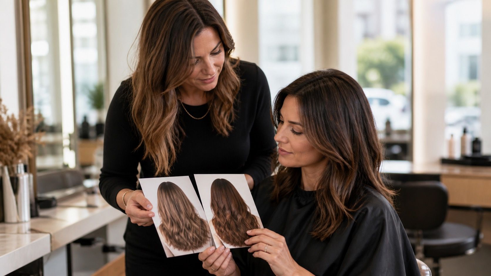
Choose two or three results that work in daylight, not one “perfect” filtered image. Keep the original photo beside them. Then describe the change in plain terms: lighter around the face, cooler than current colour, more depth at the root, or softer contrast. That is more useful to a colourist than asking for a specific app shade name.
Bring your hair history too. Previous permanent dye, bleaching, dark glosses, home colour, and very porous ends all change the plan. Ask what lift is realistic in one appointment, whether a strand test is needed, and which service creates the effect you like. The answer may be a partial foil and gloss rather than the full all-over colour in the simulation.
Finally, ask about time, maintenance, and budget before you fall in love with the lightest result. A colour that needs regular toner, root work, and heat protection can still be worth it, but it should be a conscious choice. The best hair color try on gives you a clearer reference notes and fewer surprises, not a substitute for professional assessment.