Undertone tells you whether warmth or coolness may feel harmonious, but it does not explain why a technically flattering blonde can make someone disappear or why a rich brunette can suddenly look too heavy. Contrast fills in that missing piece: it is the visible difference in lightness between your hair, skin, eyes and brows.
Contrast is the light-dark pattern around your face
Personal contrast is not a personality type and it is not fixed forever. It is simply the amount of separation your features create at a normal viewing distance. Pale skin with dark hair and strong brows reads as high contrast. Soft brown hair, muted eyes and skin close in value read as low contrast. Medium contrast sits between them and usually tolerates the widest range of colour movement.
This is why two people with a similar cool undertone can need opposite salon formulas. One may look composed with a deep chocolate root and clear highlights; the other may look far more natural in mushroom brown with a softly blurred face frame. Skin value and eye contrast matter as much as the temperature of the pigments. Hair colour is part of the face, not an isolated accessory.
Use a black-and-white photo as a quick reality check
Take an unfiltered photo in open shade, convert it to black and white, and step back from the screen. Do not analyse every freckle. Look for the larger blocks: hair, brows, eyes, skin and lips. If your natural hair forms a gentle border around the face, a dramatic depth change may feel louder than you expected. If your features already have crisp light-dark separation, a single flat mid-tone can remove useful definition.
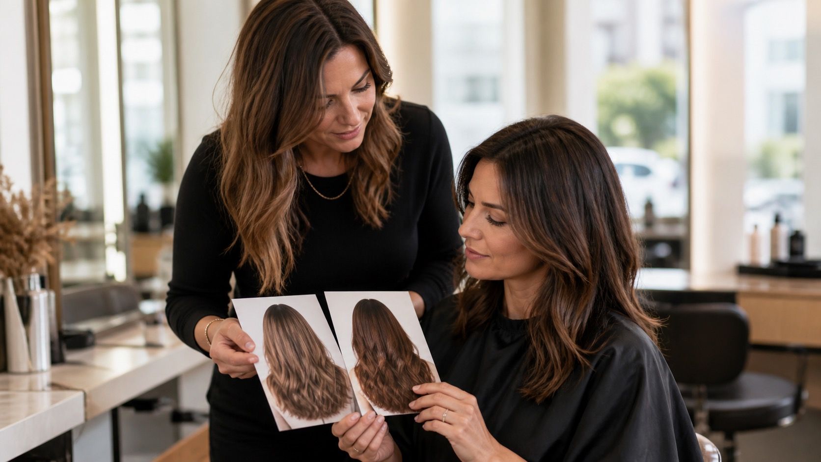
Do the same with a saved reference photo. A warm brunette and a cool brunette may look different in colour, but the grayscale version reveals whether the reference is actually much darker than your natural base. That is often the hidden reason a photo does not translate. The inspiration may be asking for a depth change, not merely a different toner.
Low contrast usually benefits from soft transitions
Low contrast features often look best when the hair remains close to the natural depth and changes gradually through the lengths. Think soft beige blonde, muted caramel, mushroom brown, or a gentle gloss rather than a sharp black-to-platinum jump. This is not a rule against drama; it is a reminder that very dark roots and bright front pieces can take attention away from the face itself.
Highlight width makes a practical difference. Fine, dispersed highlights create light without drawing stripes across the hairline. A wide pale money piece can be fun, but it should be tested in daylight because it may create more contrast than the rest of the face supports. A root shadow lets the colour settle back into the natural pattern and makes regrowth less abrupt.
Medium contrast lets depth move in either direction
Medium contrast is adaptable, but it still needs a plan. You can darken the base by one or two levels, brighten selected areas, or add a face frame without immediately changing the whole balance. The trick is to avoid making every element stronger at once. Darker hair, bolder brows, very light highlights and heavy liner can all work, yet together they may feel more theatrical than intended.
Ask what you want to be the focal point. If you love your eye colour, a slightly deeper base can make it clearer. If you want a softer overall effect, keep the root near its natural value and use low-contrast ribbons. This kind of color analysis hair approach is less glamorous than choosing a shade name, but it saves people from correcting an expensive overcorrection later.
High contrast can carry clarity, not necessarily black hair
High contrast does not require jet black hair. It means the face can usually support clearer separation. A deep brunette with a defined face frame, a darker root with bright but controlled blonde, or a vivid red against fair skin can all feel coherent. The safest mistake is assuming that every high-contrast person needs maximum darkness. If the skin is light and the natural brows are soft, near-black can still dominate the room.
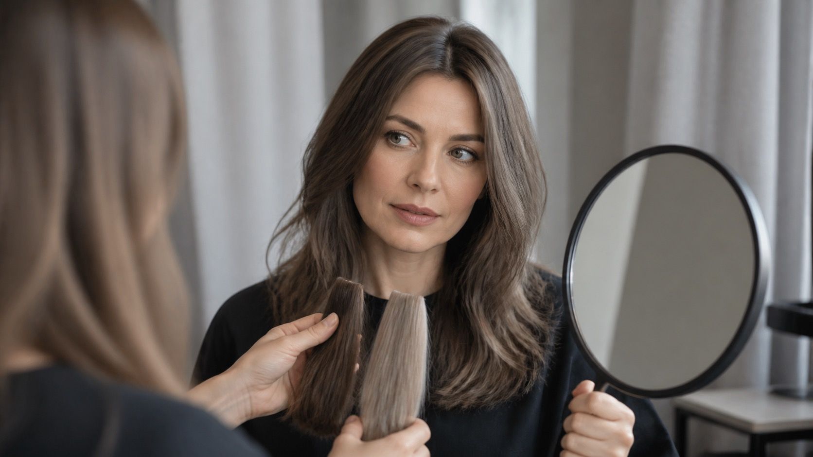
Test a depth change with a temporary wig, a clipped swatch, or even a tucked dark scarf under the hair. Pay attention to the eyes and mouth. If they become more visible, more depth may be useful. If you suddenly feel you need stronger makeup to look awake, the formula may be too dark. The test is not about looking younger or more polished; it is about whether the face still arrives before the colour.
| Contrast level | Colour strategy | Common trap |
|---|---|---|
| Low | Keep root and highlights close in value; blur transitions | Wide pale streaks or a near-black base |
| Medium | Change one variable: depth, brightness, or face framing | Strengthening every feature at the same time |
| High | Use clear depth and deliberate light-dark placement | Assuming black dye is the only dramatic option |
Match contrast with undertone instead of choosing between them
Undertone decides the family; contrast decides the volume. A cool, low-contrast person may prefer a soft ash brown rather than an icy platinum. A warm, high-contrast person may look excellent in deep chestnut with golden dimension instead of pale honey all over. When these two ideas disagree, look at the face in daylight and choose the adjustment that produces the least visual strain.
Brow colour belongs in the calculation too. A big lift can leave brows looking unexpectedly heavy, while a very dark dye can make light brows vanish. There is no need to match them exactly, but the relationship should look intentional. Discuss this before the service, especially if your plan includes a major shift in hair depth.
Make a change in stages if the photo asks for more contrast
Contrast changes are easy to overdo because the salon result is seen at its freshest. Start with a root shadow, a few deeper lowlights, or a controlled face frame, then live with it through work lights and outdoor light. If the new contrast feels right after two weeks, you have a stronger basis for a larger move. If it feels tiring, you have not committed the entire head of hair to a correction.
The best shade is rarely the one with the most impressive name. It is the one that respects the natural light-dark structure of your face while giving you the mood you wanted. Use undertone as the compass, contrast as the scale, and your everyday mirror as the final check.