A free hair color analysis at home can be surprisingly revealing when it is done as a comparison rather than a personality quiz. You do not need special cards or an expensive lamp. You need a quiet patch of daylight, a face without heavy makeup, your natural root colour in view, and enough patience to compare only a few options at once. The goal is a sensible shortlist you can take to a colourist or test with a temporary product, not a diagnosis carved in stone.
Set the room up so the colours get a fair hearing
Stand beside a north-facing or shaded window if you can, never in direct noon sun. Direct sun makes almost every hair colour sparkle and hides the dullness that appears later indoors. Turn off yellow bathroom lights and avoid a brightly coloured wall behind you. A white towel over your shoulders is a small but useful trick: it stops a black top, red sweatshirt, or patterned dress from pushing your skin warmer or cooler by reflection.
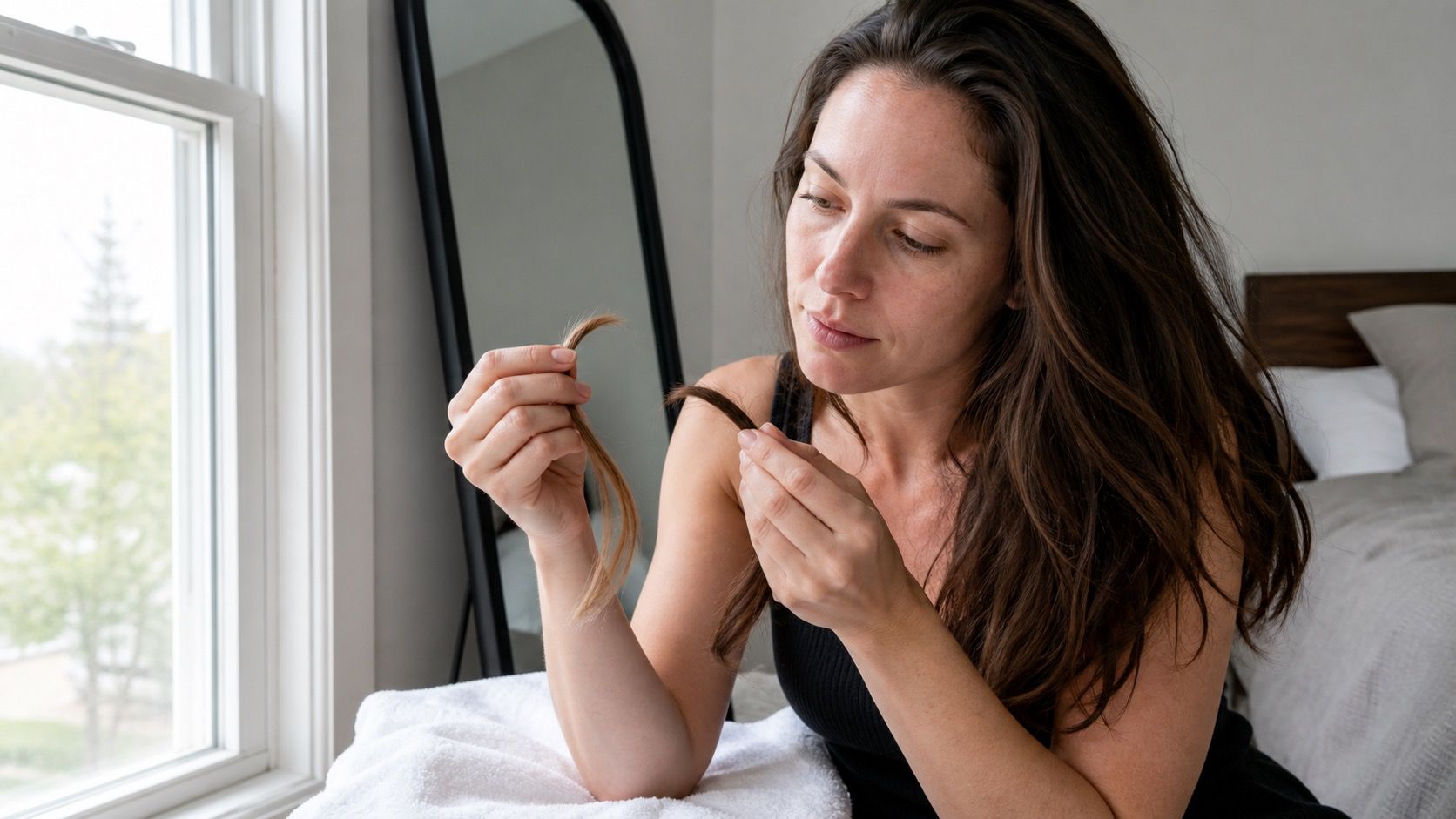
Start makeup-free, or at least without bronzer, bright lipstick, and strong foundation. This is not about looking presentable for a photo. You are looking for the natural shadows beneath the eyes and around the mouth, because those are the first places an unfriendly hair tone exaggerates. Keep your hair loose and make sure the roots are visible. Your regrowth is often more dependable than the faded lengths when deciding where to begin.
Find a likely undertone without relying on one old test
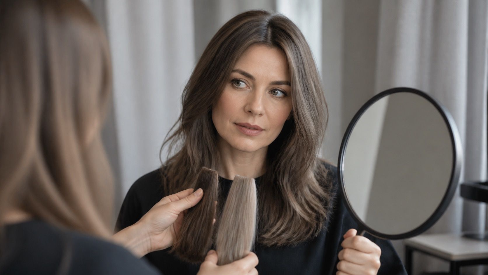
Hold a cool grey, muted blue, or silver fabric under your chin, then try soft cream, camel, or muted warm beige. Notice which one makes skin look smoother and the whites of the eyes brighter. Do this twice, taking a phone photo each time. The difference is sometimes subtle, but it becomes much clearer when the images sit next to one another rather than being judged from memory.
Veins and jewellery are supporting clues, not the whole case. Blue-looking veins and a preference for silver may point cool, while greenish veins and aged gold may point warm, but many people sit close to neutral. If both silver and gold work, do not force a result. In hair colour, neutral often means you can borrow from either side as long as the shade is not too yellow, too orange, or too smoky.
Test lightness before deciding whether you want ash or gold
Most at-home mistakes happen because hue gets all the attention. A beautiful cool blonde can still look wrong if it is four levels lighter than the brows and natural root. Use two towels, hats, or even edited screenshots to compare a lighter and darker value near the face. Ask whether your eyes stay visible. If your features disappear under very light hair, keep a deeper root or choose a dark blonde instead of a pale one.
| Quick test | What to compare | What the result suggests |
|---|---|---|
| White towel photo | Skin beside neutral white | Whether redness or yellow cast is natural or reflected |
| Cool versus warm fabric | Under-eye shadows and jawline | A direction for toner and reflect |
| Light versus dark frame | Eyes, brows and facial definition | A comfortable depth range |
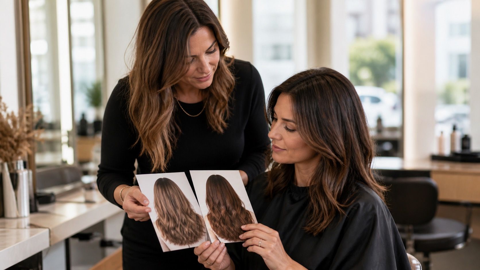
| Root beside inspiration photo | Distance from natural base | Likely upkeep and regrowth visibility |
For face framing, hold a narrow strip of the proposed colour near the temples rather than covering the entire face. Brightness around the face can be flattering even when a full head of that lightness would be too much. Conversely, someone who likes a dark overall look may need a few soft pieces around the hairline to avoid a severe effect. This is why one “best” shade is rarely enough.
Make a three-shade shortlist instead of collecting fifty ideas
Write down three candidates with a clear difference between them: for example, neutral medium brown, cool beige dark blonde, and muted copper brown. For each, note the level, the direction, and the maintenance issue. A useful shortlist has a safe option close to your base, one modest change, and one colour you are genuinely curious about. It gives a salon appointment shape without locking you into a dramatic promise.
Use the phone camera plainly. Disable smoothing and portrait blur, hold the phone at eye level, and take each comparison at the same window position. Review the images the next morning as well as immediately. A shade that feels exciting at night can read strangely yellow, flat, or harsh after a little distance. If you try a washable colour product, do a patch test according to its instructions; “temporary” does not mean allergy-free.
Know when the home method has reached its limit
An at-home hair color analysis is good at finding directions, but it cannot assess previous colour history, porosity, grey coverage, or the lifting path needed to reach an image safely. A colourist is worth the visit when you have box dye buildup, very dark artificial colour, uneven bleach, or a plan that requires a large jump in lightness. Those are chemistry questions, not failures of your eye.
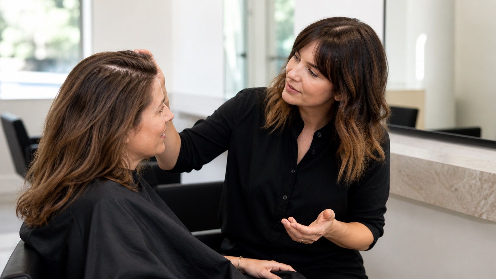
Bring your three photos and describe the result rather than naming a season as if it were a prescription. Say that the cool comparison made your skin look clearer, or that pale blonde removed too much definition. Ask what can be achieved without damaging the lengths and what the colour will look like when it fades. That is how a free hair color analysis becomes useful in the real world: it gives you better questions, a calmer choice, and fewer expensive surprises.
Use the result as a decision, not a promise
Repeat the comparison on a second day if the answer is close. Cloud cover, tired eyes, and a warm phone screen can all change a borderline result. The useful outcome is not “I am definitely this season.” It is “these cool-beige and neutral brown directions leave my face clearer than strong gold.” That is enough to rule out costly detours and enough to ask for a thoughtful test strand or gloss.
Keep the notes with your inspiration images: window position, current root, shades that felt too light, and the colour you want to test first. When a colourist sees both the photos and your observation, the appointment becomes collaborative rather than a gamble. Your at-home method has done its job if it narrows the choice and makes you less likely to buy a colour simply because it looked convincing on someone else.