A free virtual hair color try-on is best treated as a conversation starter, not a promise from a salon chair. It can help you notice whether warmer, cooler, lighter, or deeper hair changes the balance of your face. It cannot see old dye, porosity, or the chemistry behind a dramatic lift. The trick is to use the simulation for the decision it can actually support.
Know what a free try-on can show before you trust it
A virtual hair colour try-on can be very good at broad direction. A chestnut overlay may reveal that your features need more depth; a pale blonde overlay may show that you enjoy a brighter frame around the face. When the masking follows your hairline reasonably well, it can also help distinguish “I like this colour” from “I like this person’s haircut and lighting.”
It cannot calculate the starting point on your head. A photo does not show whether the ends are coloured, whether a red pigment is underneath, or whether the hair can be lifted to a level nine without damage. Filters also lay a smooth shade across uneven hair, which is why a simulated cool brown may look seamless while a real colour correction would need more than one appointment.
Use the result as a visual preference record. If three medium neutral browns make your blue-grey eyes clearer than three blondes, that is useful. If one exact filter looks perfect and every nearby shade looks strange, assume the filter is flattering its own lighting rather than revealing your inevitable future colour.
Make the photo boring on purpose
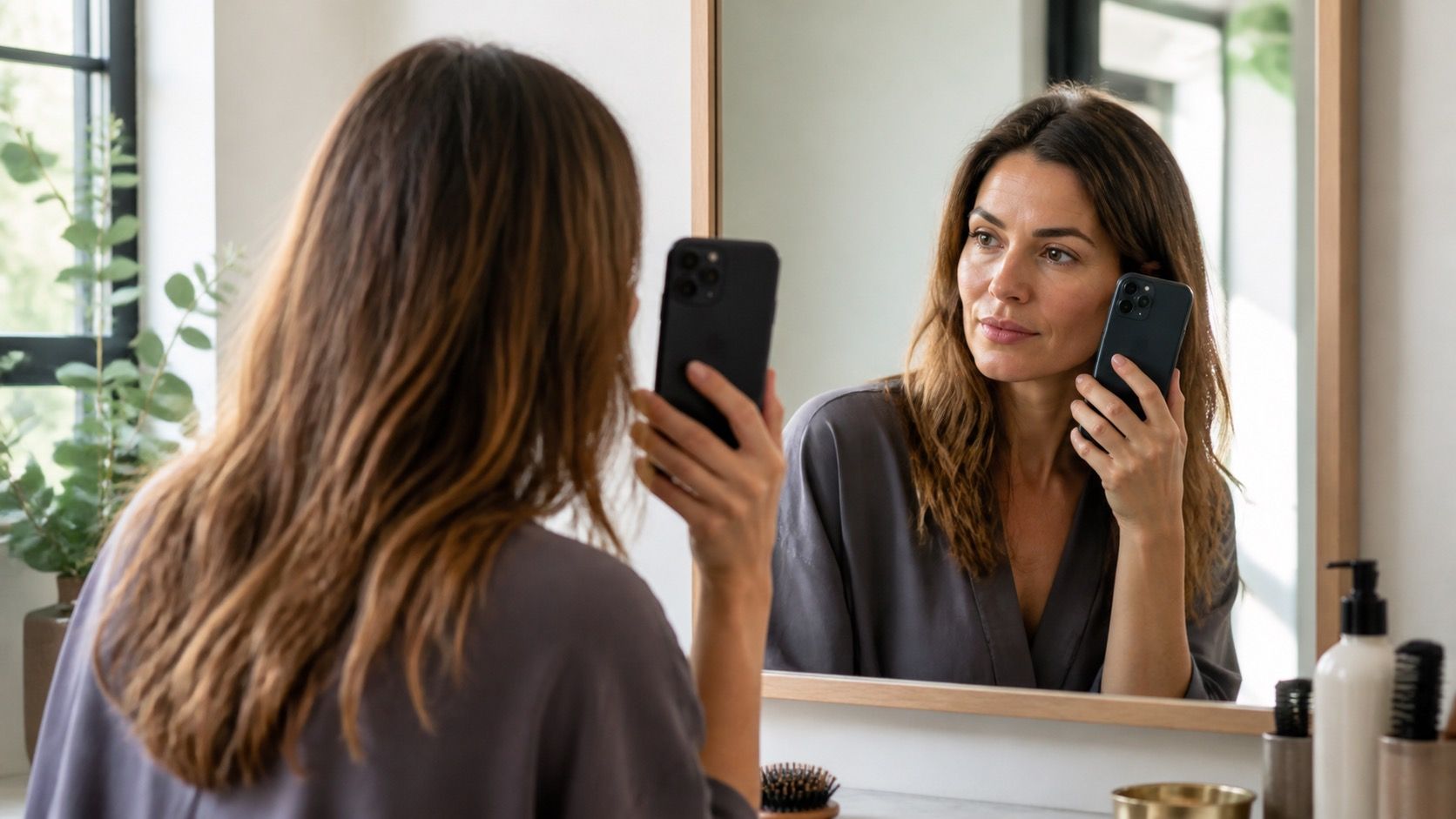
The best front-facing photo is taken in daylight near a window, with your face level and hair visible from root to ends. Plain daylight is not glamorous, which is why it is helpful. It gives the app a more honest version of skin tone and gives you a baseline you can compare later. Stand against a neutral wall if possible; a bright green bathroom tile can confuse camera white balance.
Turn off portrait smoothing, beauty mode, and colour filters. They can erase the redness, shadow, and texture that make a shade either harmonious or wrong in real life. Take off tinted glasses, pull hair away from the face if it hides the hairline, and avoid a strong overhead lamp. If the room is very warm, the app may convert the entire image into a cooler scene before it has even added hair colour.
Take a second photo outdoors in open shade, not in direct sun. Compare the simulations on both images. A shade that works only in one photo is not necessarily useless, but it needs a question mark beside it. Consistency across two ordinary photos is much more valuable than a dramatic result from one polished selfie.
Compare a shade range instead of hunting for one magic result
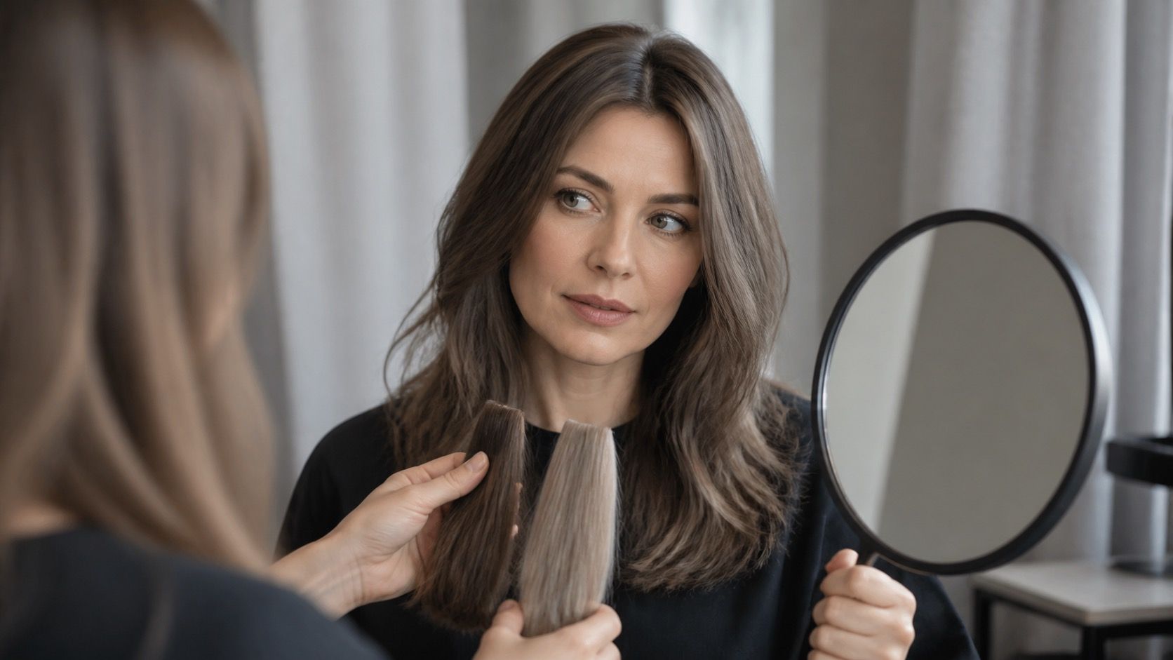
Choose a small set: two options close to your current depth, two one level lighter or darker, and two variations in temperature. For example, compare neutral medium brown, cool medium brown, soft copper, and muted dark blonde instead of scrolling through fifty novelty colours. Put the images side by side and give each one a simple note: clearer skin, brighter eyes, stronger brows, or too much contrast.
Start with depth before temperature. A very light warm blonde and a very dark ash brown can both be “wrong” for completely different reasons, so comparing them tells you little. Once you find a depth that feels plausible, move the shade slightly cooler, warmer, or softer. This is where a free tool is surprisingly useful: it lets you test a realistic shade range without the pressure to pick a single name.
| What to compare | Useful question | Common mistake |
|---|---|---|
| Depth | Does my face still look balanced at this lightness or darkness? | Changing depth and warmth at the same time |
| Temperature | Does the shade make skin look clearer or more flushed? | Judging under one warm indoor photo |
| Placement | Would I prefer a face frame, highlights, or an all-over effect? | Assuming a flat digital overlay equals a salon technique |
| Maintenance | Would I still like it with a visible root after six weeks? | Saving only the brightest first-day result |
Spot the signs that a simulation is flattering the software
Check the hairline first. When the overlay spills onto the forehead, covers an ear, or leaves a halo around wispy pieces, the colour is not being applied to the same shape you see in a mirror. It can still show whether you like a general direction, but it cannot tell you how highlights will frame your face. Ignore the glossy perfection and focus on the colour next to the skin.
Watch for a sudden change in eye colour, skin smoothness, or face shape when you switch shades. That suggests the tool is applying a wider filter rather than a hair-only shade simulation. It is especially misleading with bright red, black, and platinum options because the app may increase contrast to make the result look more dramatic.
Also be cautious with one-click grey coverage and blonding effects. Real roots, highlighted ends, and older colour reflect light differently. A virtual result with one uniform tone can be a useful mood board, yet it does not answer whether the service should be foils, a root melt, glossing, or colour correction.
Turn saved screenshots into useful salon notes
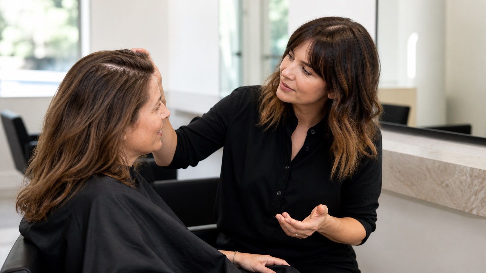
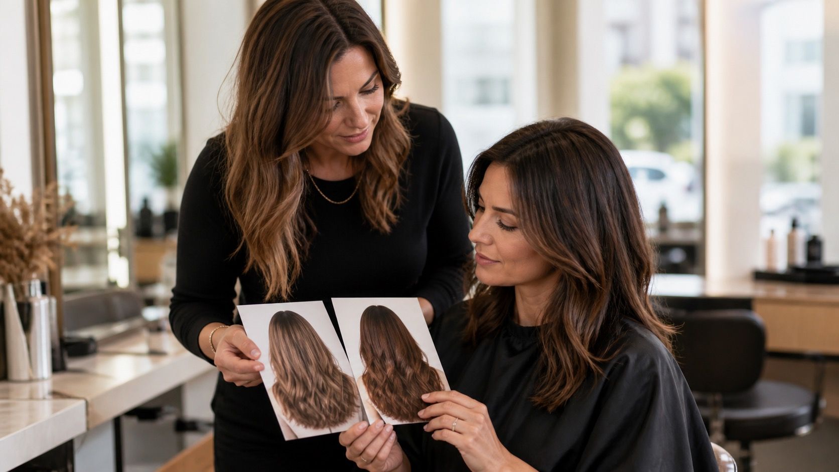
Save three winners and one near-miss. The near-miss is often the most useful image in a consultation because it gives the colourist a clear boundary: “I like the depth here, but not this much gold,” or “I want this coolness, but less grey.” Add an unedited photo of your current hair in daylight so the comparison is honest.
Write down what has been on your hair during the last year: permanent colour, box dye, bleach, glosses, henna, or dark toner. A colourist needs that history to judge what is realistic. The app screenshot belongs at the start of the conversation, while your hair history decides the service and timing.
Before you book, ask yourself whether the result requires frequent root coverage, a toner refresh, or a major lift. A screenshot can make a large change feel effortless; your calendar and budget may disagree. The most helpful virtual try-on result is the one that helps you ask better questions, not the one that convinces you a filter is a guarantee.